| | | |

Wish you were here!: a #Prisoner106 design assignment

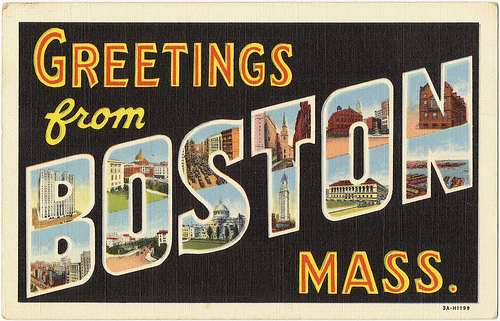
Design Week in The Village kept me busy.  I took on the Postcards from a Magical Place (#363) assignment.  If I followed directions, I would’ve designed both the front AND back of a postcard.  I only designed the front.  Why design the back of a postcard from The Village when there is no outgoing mail here?

The Village is truly a magical place though.  I did my best to capture the majesty of the mountains, our inspired chess games, and our ever-present sentinel, Rover.

Greetings from The Village

This version isn’t fit for The Village store, but some progress was made.  “The Village” doesn’t pop as much as I would like.  Actually, none of the text does, but that’s something to fix later.  Perhaps something like this:
Wish you were here!: a #Prisoner106 design assignment

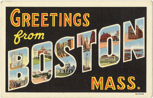
vintage postcard

I used the Seaside Resort font for the smaller text and found the Vacation Postcard font for “The Village.”  However, I quickly discovered that I couldn’t fill that text with an image as I explained in this post.

Wish you were here!: a #Prisoner106 design assignment

Only the outline of the text would fill with the image

A more experienced GIMP/PhotoShop user may know how to get around the problem.  I couldn’t make it work despite the good suggestions left in the previous blog post.

This is what I did (I think):

1.  I opened the image of the chess scene

2.  I added the “Greetings from” and “Be seeing you” text layers and moved those around as needed.

3.  I added “The Villlage” text layer and rotated the text by going to layer > transform > rotate > arbitrary rotation.  I used -15 as the angle.

4.  I followed the steps in the “How to Create a Vintage Postcard in GIMP” tutorial for blurring “The Village” text in order to get a nice 3D effect.  I duplicated “The Village” text and then added a blur filter to the duplicated layer.  Activate the copy/duplicate and select filter > blur > motion blur.  I used a length of 20 and an angle of 205.

Wish you were here!: a #Prisoner106 design assignmentKeep making copies of the blurred layer until you have a nice 3D effect.  Then hide all but your blurred text layers.  When these are the only layers visible, right click them and select “merge visible layers.”

You can also select colors for your main text and the blurred text layer so that you can tell the two apart.

Wish you were here!: a #Prisoner106 design assignment5.  Add the image that should appear within your text.  Add an alpha channel to this image by right clicking the layer.

6.  Right click your main text layer.  Click “alpha to selection”

7.  Turn off your main text layer.

8.  Activate the image layer.  You’re now ready to delete everything outside of the text.  Go to Select > invert and then go to Edit > Cut.

(The screenshots below aren’t part of my actual project, which is why you don’t see all of the layers I had)

Wish you were here!: a #Prisoner106 design assignmentWish you were here!: a #Prisoner106 design assignment

Though the final product isn’t what I envisioned, I ended up learning a lot about GIMP.  Again, this “How to Create a Vintage Postcard in GIMP” Youtube tutorial was extremely helpful in the process.

I also found an easy explanation for adding image to text here.
Similar Posts

  • | | | | | |

    “A reasonable alternative is to complete a piece that…

    “A reasonable alternative is to complete a piece that incorporates two different assignments for a sum total of 4 or more Credit Units.” 

    So I did the ‘I can read movies assignment’ and ‘the one story 4 icons’ assignment in one cover. The electricity in my tree house is on for another week as I am clocking 6 Credit units and another 2 for the extra hard work to combine two assignments into one. Although to be fair, I took this on thinking it would be easier than doing two. The new number two is clever with words. A reasonable alternative, indeed. I think I should get an extra 2 Credit Units for doing the whole thing rather than just one episode, but that might be pushing it a bit. 

    Behind the scenes

    I wish I had used my notebook as I intended to keep up with all that I tried. A little like our resident artist  futzing was a key ingredient. 

    I started with the idea that I wanted the cover to embody the sense of ambiguity  that is the hallmark of the series. I read an amazing blog post today that spoke about the series as it “constantly offering us a seeming chance for escape, then pulling the rug out from under us.”  Nothing is as it appears. 

    The post explores a Prisoner computer game that never tells you that you can escape the game by pressing the ESC key! The tag line of my cover comes from the end of this game. You win and it tells you: To win is to lose. Sheer genius.

    The 4 icons are from our friends at the Noun Project. How awesome are they? I bought them all ‘cause I love supporting their artists.

    I have been using their icons in my Prisoner posters series as comas and full stops since this run of DS106 started. It occurred to me that may be the ones I had chosen over time would embody key themes. I was right. 

    Birds singing seem happy and free, and yet the noise may attract attention when it is not wanted.

    A prisoner in jail might seem a negative icon, yet prison is not always a bad thing. (I will not explain the photo below to avoid spoiler for participants still watching episodes).

    The fish escapes the fish bowl and is free then it dies as it lands.

    The sad ghost represents death and suffering and yet, if ‘to win is to lose’ may be to lose is to win?

    The cover is for book 1 and it contains the story of 6. Hence 6 is 1.

    I used Photoshop as usual. Started with one of the covers from the I can read movies series that was cleanest to get a clean black background with the clone tool. I started with a lot more text which disappeared as the 6/1 tension shaped my thinking. I discovered you can search google by ‘type’ of image as well as usage rights and this can find you components to use in a creative edit. The lapels from the jacket came to me that way. I pulled them out of original image roughly with quick selection tool and then added it in with screen blending option to blend in with the grainy black background. My little friend the colour dropper did its job to blend all the colours well. A little blur tool helped me along.

    For the first time ever I grouped some layers so that I could line them up properly. The little icons and its background were a group. I used the Emboss Texture blending option to create a rough look to the background.

    I feel I have got as close as I can to the essence of what makes this my favourite series of all time. It is to do with the ‘nothing is at it seems nature’ of it. The kind of story that destroys mechanisation by remembering that what makes us human are non-googlable questions such as why. Awesome.

    This constant tension is even shown in the way the prisoner dresses. The lapels of the blazer showing that we have a prisoner dressed in a suit, highlighting perhaps that we cannot tell from external cues who is the prisoner and who is the guardian. 

    Total time spent: several days to get the bits and this afternoon pulling it together. I wanted to challenge myself so I did my best to attend to small details  I might ignore in the usual run of things. Cool challenge, Number 2. 

    Be seeing you. 

  • | | | | |

    Another poster with wisdom from @everyadage and for my…

    Another poster with wisdom from @everyadage and for my typography collection. I did not play with font and kept it Village Plain so we can use it around the village. 

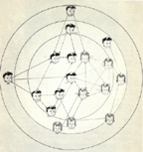
    Source of image: A targeted Sociogram by Mary Northway of a first grade class, drawn by hand by Grant, one of her students, in 1952. I am writing a post about what I feel this expresses about open online learning and social networks elsewhere but here I want to talk about getting this into a shape I could use.

    I originally found this:

    As you can see not much could be done with it. Yet, I knew I wanted the contrast of Twitter bot wisdom with a human social network not an impersonal set of nodes. I had the idea that this could be ‘then and now’ not just in terms of evolution of visualisation of networks, but also ‘then and now’ as in childhood playground network and the online networks of today. 

    I searched and searched. I found a better image but not a great one and decided I would learn about how to restore and image in photoshop. There must be something the mighty photoshop could do beyond just image size, which was all I could think of doing. I searched some more. I found a tutorial about giving old pictures new life. I followed it. It was awesome. I even managed to highlight one little girl at the edge who had only two unidirectional arrows, I wanted her to be the focus for the ‘those who break’ part  of the adage. You cannot read them, but can see that each ‘node’ has a name as well as a face. How human and touching was that way of analysing interactions? 

    The poster speaks to the shadow side of online connecting – not all belong and some break and leave. Often early on. 

    I think this is worth many work units and should keep electricity on in my tree house ( I know the transporter uses up a lot of it getting back and forth to Bovine). I am so pleased with the result even though it is so subtle and in some sense changes nothing of the original image. To me, it is like it has come back to life!

  • | | | | | |

    Prisoner GIFFING – Number 6 Repository Adds

    After a couple of days working on GIFs I have to admit – the ones from video clips come to me as storytelling and drawing out and explaining meaning or understanding from the work of others stories. Creating GIFs from scratch to add to one’s own story is different. They are both great and fun … Read more