| | | | | | | | | | | | | |

I Can Read Televison – Free Man

“I Can Read Television: Free Man 2″ by aforgrave on Flickr

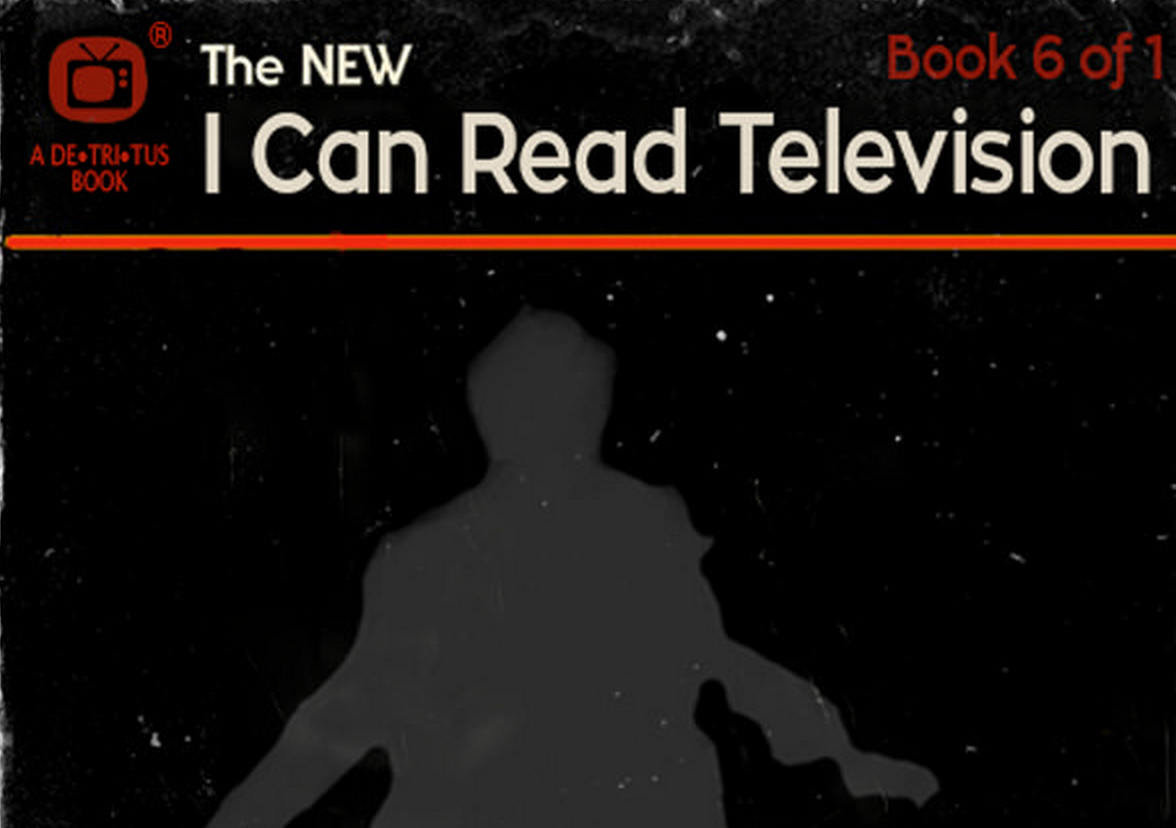
I like the “I Can Read Movies” Design Assignment 55. It’s fun to try to capture a movie (or television show) with a cover image as well as imagine the design of an old paperback book.

The Basics

  • This book cover is based on the Spacesick’s Jurassic Park rendering — I liked the black background and roughed edges for my Prisoner book.
  • I font matched the “I Can Read Movies font on whatfontis.com with a close match Zona Pro, and used that to re do “I Can Read Movies” to “I Can Read Television.”
  • To deal with the movie-to-television switch, I sourced and licensed an icon of a Television on The Noun Project by John Caserta and updated the logo and publisher branding in the upper left corner.
  • In conjunction with the logo revision, I switched the colour scheme from yellow/black to red/black.
  • Giving the book a 6 of 1 numbering seemed appropriate.
  • The teaser beneath the title was re-written, and the title redone (using the Village font) to Free Man. I think “Free Man” perhaps communicates a wider and appropriately more open-ended set of messages for the show than just “I am a Free Man.”

The Cover Image

I Can Read Televison – Free Man

The trickiest part of this particular book cover was getting a silhouette image of Number Six on the beach during his “I am not a number, I am a free man!” speech. Although I somehow have a fairly good idea of the physical movements he goes through at that moment, it’s surprising how poorly lit that sequence is. I tried four times (from different sources, too) to capture frames that I could use.

I’d had a run at enhancing this sequence once already when I tackled “Google Says … I am Not a Number” last week. It might be easy to miss in the original GIF, but there is an excerpt of the whole opening scene hidden in the search results at the end. In working with the frames from the defiant speech, I had to significantly adjust both the brightness AND the contrast to get something useable.

So in working to get a silhouette of Number Six on the beach, I again went back and tried to adjust brightness and contrast.

I tried adjusting brightness and contrast manually, frame by frame, in Photoshop. Labourious work, and I wasn’t pleased with the results. I needed more frames to work with than I’d originally grabbed.

I went back into MPEG Streamclip and tried exporting at 24 frames per second rather than the 6 per second I had previously used.  Unfortunately, that didn’t give me any better silhouettes than the ones I’d had before, just more of them.

MPEG Streamclip allows you to select the colours or shades of grey in the images that you export. I tried 256 greys, as well as 16 greys, hoping that it might give me a good silhouette separate from the background. Unfortunately, that is the real problem with what has been shot — not enough light and not enough contrast.  Two few greys didn’t give enough detail. Too many greys and there wasn’t enough distinction.

MPEG Streamclip also allows you to adjust brightness and contrast during the export process. Good to know, but the first time I ramped the brightness right up (as I did in Photoshop on a frame by frame basis) I just got a whole bunch of white frames. So I had to experiment there, too.

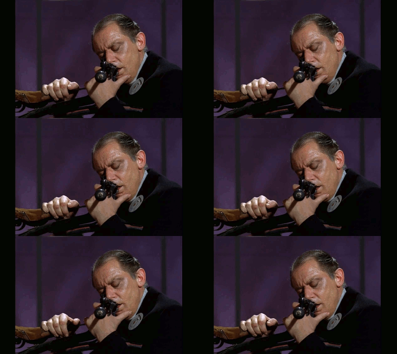
In the end, although I am not really happy with the result, I wound up with a series of frames to which I applied a Filter (Brush: Dark Strokes) that resulted in the following animation.
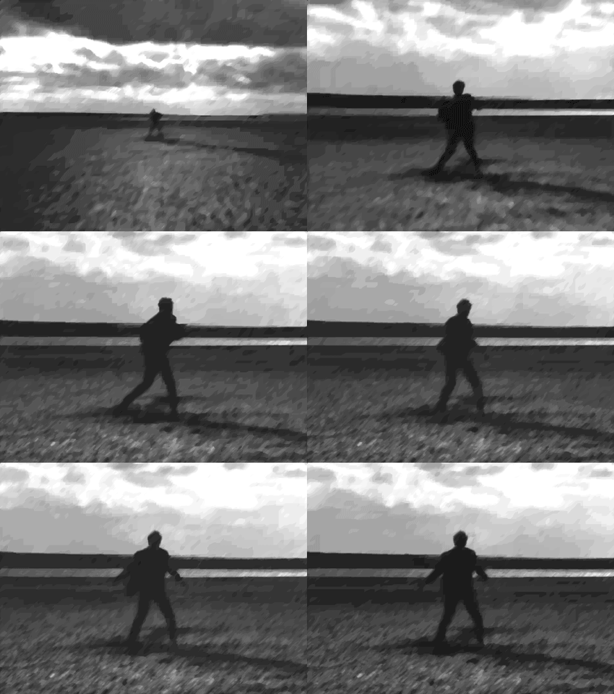
I Can Read Televison – Free Man

I selected a frame from towards the end of the sequence after the throw, where Number Six stands staring back at The Village. In the interests of time, I went with that frame — inverting it to make Number Six light and then doing a free-hand tracing around the ragged silhouette in black. I then erased all but the black-outlined silhouette using the eraser tool and placed it on the black background.

You can see the original colour of the silhouette below (the lightest, front-most one, with the black outline). Still experimenting, I added a couple extra copies with decreasing transparency, rotating and offsetting them to suggest a jarred, out-of-place character, and in the end, went with the just the third (greatest opacity) silhouette only.
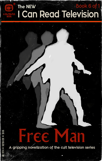
I Can Read Televison – Free Man

“I Can Read Television Free Man 1,” by aforgrave on Flickr

I may still return to the beach scene to continue to explore methods to refine the quality of that image, but for now, it is time for other things!

Similar Posts

  • | | | | |

    Another poster with wisdom from @everyadage and for my…

    Another poster with wisdom from @everyadage and for my typography collection. I did not play with font and kept it Village Plain so we can use it around the village. 

    Source of image: A targeted Sociogram by Mary Northway of a first grade class, drawn by hand by Grant, one of her students, in 1952. I am writing a post about what I feel this expresses about open online learning and social networks elsewhere but here I want to talk about getting this into a shape I could use.

    I originally found this:

    As you can see not much could be done with it. Yet, I knew I wanted the contrast of Twitter bot wisdom with a human social network not an impersonal set of nodes. I had the idea that this could be ‘then and now’ not just in terms of evolution of visualisation of networks, but also ‘then and now’ as in childhood playground network and the online networks of today. 

    I searched and searched. I found a better image but not a great one and decided I would learn about how to restore and image in photoshop. There must be something the mighty photoshop could do beyond just image size, which was all I could think of doing. I searched some more. I found a tutorial about giving old pictures new life. I followed it. It was awesome. I even managed to highlight one little girl at the edge who had only two unidirectional arrows, I wanted her to be the focus for the ‘those who break’ part  of the adage. You cannot read them, but can see that each ‘node’ has a name as well as a face. How human and touching was that way of analysing interactions? 

    The poster speaks to the shadow side of online connecting – not all belong and some break and leave. Often early on. 

    I think this is worth many work units and should keep electricity on in my tree house ( I know the transporter uses up a lot of it getting back and forth to Bovine). I am so pleased with the result even though it is so subtle and in some sense changes nothing of the original image. To me, it is like it has come back to life!

  • Reboot GIFs

    Andrew Forgrave has given a wonderful introduction to the 1990s Reboot series, and how fun it is to create GIFs from the Number 7 episode (available on the Prisoner106 Archive page). Today I watched the episode, and once again realize that so much has been created in niches of popular culture that I have not […]

  • | |

    The village psychiatrist was inspired by our resident dreamer’s…

    The village psychiatrist was inspired by our resident dreamer’s calming morning announcement into creating her first full track of calming music. I have titled it ‘Something mental to aid sleep’.  Here at the hospital we are always concerned with the well being of our prisoners residents and this track should be safe to listen to just as you are settling into bed after soothing day of passeggiata in the village. Enjoy.

    Behind the scenes

    I have been meaning to learn how to use the new Garageband for a while. So after several tutorials and muttering that the old one was better, I managed to stay with it and learn. It looks like it will even teach you how to play an instrument now. But that is for another day. 

    Today I just decided to make on track. I had forgotten how much I like to edit sound. Up here, down here, left a bit right a bit….much fun.

    Credits to: Ms Talky Tina with material from the archives, to 

    Riccardo Colombo for a lovely background to all my craziness from Jamendo. The rest is my own bits an bobs and GarageBand’s own amazing new sound effects and loops. I had like 10 tracks mixing and blending. Rest well after you listen, if you dare. And I note that Ms Tina did actually put a coma in. Who is N1? You are, number 6. Mystery solved as Ms Tina knows the truth. 

    And you know what would help us great deal? If both village committees got together and we had to practice the same type of thing each week. This week design in fairy tales and then audio with the prisoners. This shrink is pooped. 

  • | | | | | | | | | | | |

    Portmeirion Flyovers

    Well, I was trying to get some nice maps working today, but you will have to settle for one that is a flyover type. There are some details that this GIF does not show (not to mention the Secret Tunnel Passages layer and @iamTalkyTina Hideouts maps that I was going to include) but they will […]

  • | | | |

    Labyrinth Tales, a #ds106 radio show

      There were two open, online versions of #ds106 this summer: The Burgeron Family Fairy Tale Festival #prisoner106 Though some of us focused on one and others on the other, many of the open, online #ds106 participants came together to create a joint radio show combining themes from both summer #ds106 experiences. The result is …