The raging headache I’m experiencing could be a result of my social conversion therapy or perhaps it’s a result of the design assignment I’m currently working on.
I’m trying to make a vintage postcard. I’ve been following this tutorial on Youtube, and it’s been helpful for the most part:
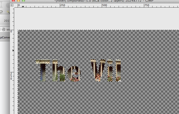
I’m having zero luck filling “the village” with the rover image you see in the video below.
So far I’ve tried the method described in the handy tutorial and my video above (selection to alpha > shrink (optional, I think) > invert > cut.
Unknown yet to the Burgeron family in Bovine TX, yet well known soon in The Village: Daisy (aka Dark Daisy). Don’t let those cute cheeks fool you, you’ll never know which side she’s on. And, she ain’t telling you, because … Continue reading →
Typography & Symbols Studio Two Three is a wonderful community print shop located in Scott’s Addition. They offer a variety of classes, from hand lettering to lithography. They’ve been known to use a steamroller to print giant maps of Richmond. … Continue reading →
It’s been quite awhile ago, but for week 5 for #prisoner106 one of the assignments was to create a campaign video because we seemed to be missing a Number 2 and we might need to hold an election. I’m treating this very belated video as a kind of final project, since for it I made: …
No.6 says “Reject this false world of #2 NOW!” No. 6 says “I am not a number, I am a person”. Sappho quotes No. 6 “I will not be pushed, filed, stamped, indexed, briefed, debriefed, or numbered! My life is … Continue reading →
Another poster with wisdom from @everyadage and for my typography collection. I did not play with font and kept it Village Plain so we can use it around the village.
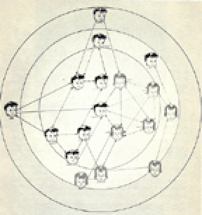
Source of image: A targeted Sociogram by Mary Northway of a first grade class, drawn by hand by Grant, one of her students, in 1952. I am writing a post about what I feel this expresses about open online learning and social networks elsewhere but here I want to talk about getting this into a shape I could use.
I originally found this:
As you can see not much could be done with it. Yet, I knew I wanted the contrast of Twitter bot wisdom with a human social network not an impersonal set of nodes. I had the idea that this could be ‘then and now’ not just in terms of evolution of visualisation of networks, but also ‘then and now’ as in childhood playground network and the online networks of today.
I searched and searched. I found a better image but not a great one and decided I would learn about how to restore and image in photoshop. There must be something the mighty photoshop could do beyond just image size, which was all I could think of doing. I searched some more. I found a tutorial about giving old pictures new life. I followed it. It was awesome. I even managed to highlight one little girl at the edge who had only two unidirectional arrows, I wanted her to be the focus for the ‘those who break’ part of the adage. You cannot read them, but can see that each ‘node’ has a name as well as a face. How human and touching was that way of analysing interactions?
The poster speaks to the shadow side of online connecting – not all belong and some break and leave. Often early on.
I think this is worth many work units and should keep electricity on in my tree house ( I know the transporter uses up a lot of it getting back and forth to Bovine). I am so pleased with the result even though it is so subtle and in some sense changes nothing of the original image. To me, it is like it has come back to life!
 OK…. Maybe I answered my own question and need to go on another font hunt. So….